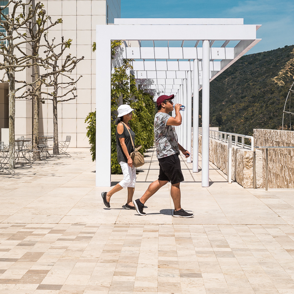
Photo by Peter W. Coulson
This is a continuation of Part 1, which talked about using color theory to make compelling images. Today, I’m going to talk about some other techniques that don’t involve color but still can help make your pictures better.
FRAMING
Framing is kind of hard to literally define, but I’ll try: it’s when you take a picture that makes it seem like one or more figures is encapsulated by another figure. In street photography, the encapsulated figure is usually a person or a small group of people, and the encapsulating figure is usually (not always) a three-dimensional form that only appears two-dimensional when it’s photographed from a certain angle. For example, when I photographed the metal structure in the lead image head-on, it showed up as a rectangle in the final picture. I waited for those two people to start to walk by the metal structure, and then fired off about six or seven exposures, one of which captured them as they walked right in front of the structure.
(Here‘s another example. I’m not sure if it was candid or staged — Lewis Hine was probably working with a cumbersome large-format camera, so it wouldn’t surprise me if it was the latter.)
This is a very, very useful technique. It works just as well in large prints as it does on small screens. You don’t need a particularly long or short lens to do it. (I use a 35mm lens on my crop-sensor digital camera, which is roughly a normal lens.) You don’t need to use any special equipment. There’s no shortage of places you can put it into action. Really, all you need is a decent camera and a bit of patience, and you can use it again and again.

Photo by Andreas Gursky.
THREE WAYS TO USE SCALE
The Gursky Method. My personal favorite, but also the hardest one to get away in the age of Instagram. Basically, you take a photo or make a stitched panorama of a scene with a lot of detail and a lot of stuff going on. I named this technique after Andreas Gursky, who does it better than anyone. His prints look excellent on gallery walls (they’re enormous), but turn into a mess on small screens. The photo above, for example, is a lot wider than Instagram’s maximum aspect ratio of 1.9:1. And even if I look at it full-screen on my laptop with my glasses on, there’s still a lot that I’m missing out on because there’s just so much going on that it needs to be printed big. This is the only technique I’d say is strictly off-limits for images that will mainly be viewed on small screens.
The Burtynsky Method. This is another use of large scale that works better on small screens. I named it after Edward Burtynsky, who’s best known for his aerial photographs that encompass a much wider field of view than anyone on the ground can appreciate. Though they work best as large prints, they can still be appreciated on small screens, especially if you do what Burtynsky does and take advantage of how the natural and built environments seem to turn into abstract paintings from high enough up.
Macro photography. You know the kind of thing I’m talking about (warning: picture is of a housefly, which might disturb you if you hate insects or were exposed to David Cronenberg movies at an easily-traumatized age). It works really well on small screens.
REDUNDANCY AND IRONY
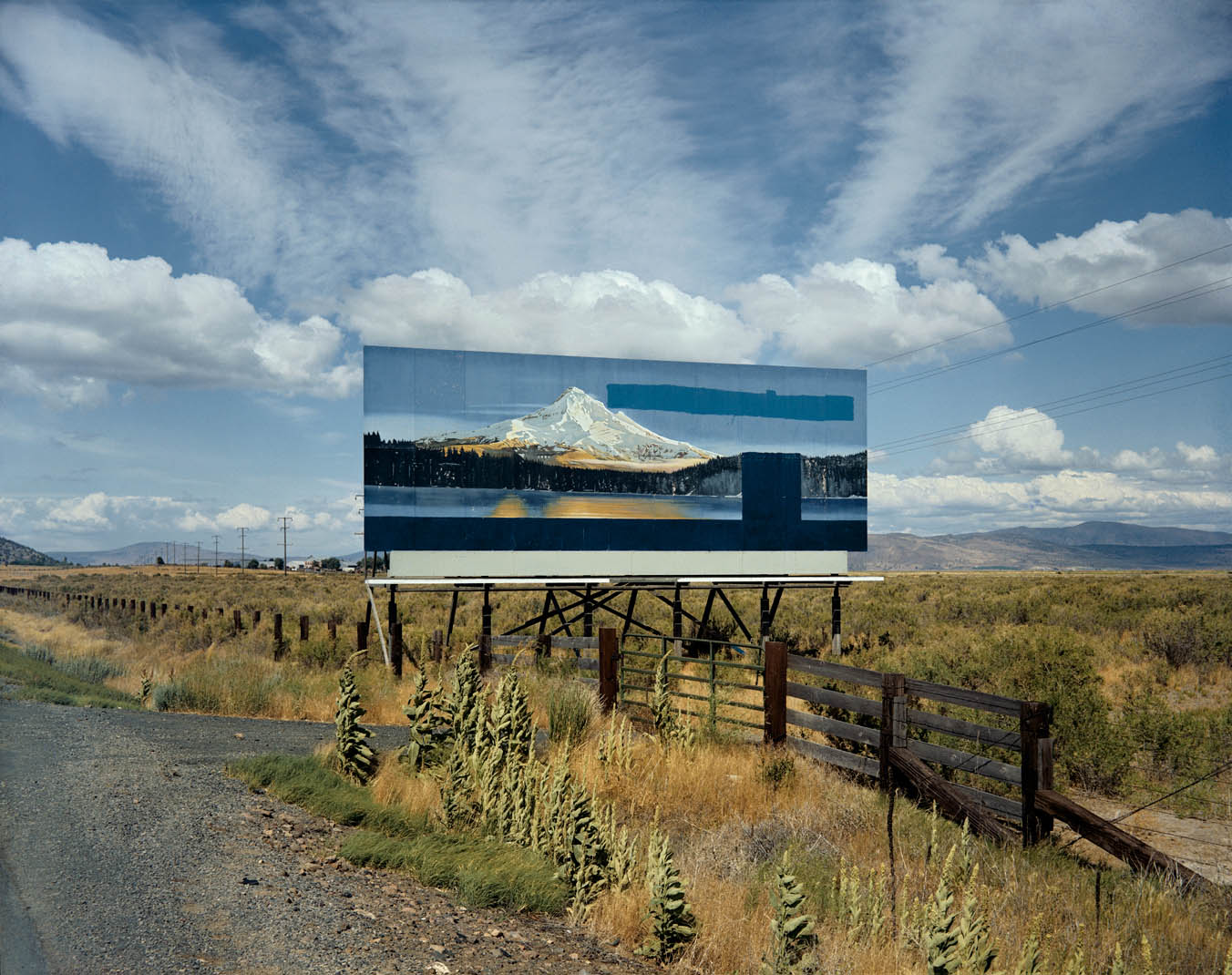
There’s a famous photo by Stephen Shore that shows a billboard of a mountain vista blocking Shore’s view of an actual mountain vista. The billboard is both redundant and ironic: it’s redundant because there’s a real mountain vista right there, and it’s ironic because it’s acting as its own antithesis, blocking you from seeing the kind of thing whose beauty it’s trying to show you. It’s a good picture because it uses those devices well.
Pictures that use things like redundancy or irony don’t usually immediately grab you (unless they’re really obvious, like a “No Smoking” sign on a wall decorated with pictures of Sherlock Holmes smoking a pipe*). They’re still good pictures, but they’re the kind of picture that need to be looked at for a little while instead of glanced at. (Instagrammers: this is another one to be careful with.) If you want to use redundancy or irony, it helps to know how people are going to be looking at your pictures in the first place.
*Which reminds me: be careful of relying on words to convey the irony. Not every viewer of your picture necessarily speaks whatever language the words might be in. If you must use signs, try to use ones that incorporate easily-recognized graphics (e.g. the red slash through a cigarette for “No Smoking”).

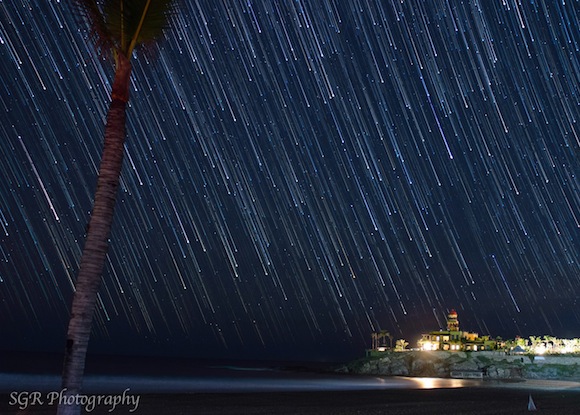
Photo by Will Coulson.
EXAGGERATED TIME AND MOTION
“Exaggerated time and motion” is my inelegant way of referring to pictures of ordinary things with either very short exposure times or very long exposure times that play with how we typically perceive of these ordinary things. For example, humans’ perception of motion is not discrete enough for us to see the little crown that a droplet of milk forms, so when we see Doc Edgerton’s high-speed photos of milk droplets, we naturally become interested. Same goes for my brother’s photo of the headlight streaks: you can’t see the streaks that headlights make, so
In general, pictures of real things that we can’t see on our own tend to be naturally compelling. I did deliberately link to common examples of this technique, but there’s so much you can do with very long and very short exposures that I won’t discourage you at all from using them.
OTHER THINGS
It should go without saying that there are hundreds of other things you can do to make your images more compelling. (For example: there are enormous books about things you can do in Lightroom and Photoshop to make your images look better [and thereby more compelling] after the moment of capture.) I’ve said basically everything that I think I can comment on, as far as my own expertise is concerned.
So: if there’s something big you think I’ve missed, feel free to let me know in the comments. In addition, I’m suspending our no-writing-submissions policy, which means that if you want to write Part 3, you can — just email me at profilesinphotography [at] gmail [dot] com and we’ll work something out.

Photo by Peter W. Coulson. You can see more of his photographs on his Instagram or his semi-website, and read more of his writing here.
Follow Profiles in Photography on Instagram and Twitter and like us on Facebook!
