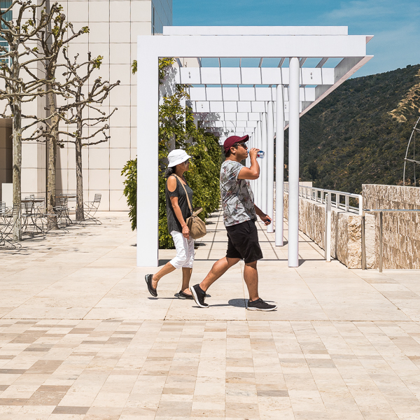
Photo by Peter W. Coulson
This is a continuation of Part 1, which talked about using color theory to make compelling images. Today, I’m going to talk about some other techniques that don’t involve color but still can help make your pictures better.
FRAMING
Framing is kind of hard to literally define, but I’ll try: it’s when you take a picture that makes it seem like one or more figures is encapsulated by another figure. In street photography, the encapsulated figure is usually a person or a small group of people, and the encapsulating figure is usually (not always) a three-dimensional form that only appears two-dimensional when it’s photographed from a certain angle. For example, when I photographed the metal structure in the lead image head-on, it showed up as a rectangle in the final picture. I waited for those two people to start to walk by the metal structure, and then fired off about six or seven exposures, one of which captured them as they walked right in front of the structure.
(Here‘s another example. I’m not sure if it was candid or staged — Lewis Hine was probably working with a cumbersome large-format camera, so it wouldn’t surprise me if it was the latter.)
This is a very, very useful technique. It works just as well in large prints as it does on small screens. You don’t need a particularly long or short lens to do it. (I use a 35mm lens on my crop-sensor digital camera, which is roughly a normal lens.) You don’t need to use any special equipment. There’s no shortage of places you can put it into action. Really, all you need is a decent camera and a bit of patience, and you can use it again and again.
Continue reading “Making It Compelling, Pt. 2—Framing, Scale, and More”
