
A triadic color scheme (cyan, magenta, yellow). All photographs in this article by Peter W. Coulson.
This week is an off week, so I thought I’d write a little bit about making compelling photos. I’m not an expert by any means, and this isn’t a complete list, just a few things involving color that lead to more interesting pictures. I’ll get into more strategies next week.
COLOR THEORY
You should learn it, look for it, and apply it. If you don’t know anything about it, Ted Gore has a good article about it on his website. He doesn’t go into the symbolism associated with the different colors, but we don’t care about that right now. Bookmark the article on your computer and your phone (especially your phone — that way you’ll always be able to reference it) and see if you can recognize any of the basic principles in visual art you encounter in your daily life. Yes, this includes movies and TV shows and advertisements. Cinematographers and art directors study this stuff for years and years; do you really think they’d never use it?
But knowing color theory, in itself, won’t suddenly make your compositions better. Applying it will.

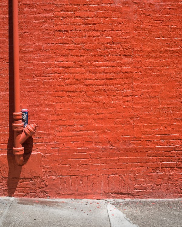
Complementary colors (orange and blue).
APPLYING COLOR THEORY
Looking for applications of color theory in media only goes so far. Eventually, you have to stop looking for it in someone else’s world (especially if they’ve got a higher budget and larger staff than you do) and start looking in your own world. You should start out by looking for examples, nothing more, only moving on to real shooting after you feel confident finding these schemes without having to refer to reference guides. Below, I’ve listed three color schemes that often show up in the natural and built environments, along with notes on how they can be used in your photos:
- Large swaths of one color (i.e. a monochromatic scheme). If you’re interested in minimalism, this is a big one to look for. A pink strip mall might be pretty ugly by itself, but a picture of a side of that strip mall against a deep blue sky looks much better.
- Little spots of complementary color in the midst of large swaths of one color. For example, people wearing colors complementary to whatever they’re standing near. This has a ton of uses, but I often use it to isolate subjects. For example, the woman in the purple dress in that second photo was the only purple figure in the scene. The wall behind her was almost entirely yellow, as was her friend’s shirt. In post-processing, I made the color of her dress more saturated and intense to increase the contrast between her and the background, consequently making her stand out even more. (I’ll write an article later about processing with color theory in mind.)
- Triadic or even quadratic color schemes often show up in gardens and parks. (Quadratic is usually easier to find in the natural environment than in the built environment.)
If you typically shoot portraits or fashion, everything on that list applies to you, too, though you should start shooting sooner since you’ll know in advance what color your main subject will be wearing. (All the following examples take place outdoors, but they’d work just as well in a studio with seamless paper.) Suppose your subject is wearing red. You could shoot outdoors in an area with lots of grass or green plants for a complementary color scheme, or in a place with lots of red-colored things for a monochromatic color scheme, or against something orange-red for an analogous color scheme. On occasion, you can incorporate the subject’s skin tone into color schemes. This picture uses a triadic scheme: the model has tan skin (which is a shade of orange), wears a purple-magenta dress, and is standing in someplace with lots of green foliage.
(Above all else, please remember that these aren’t strict rules. The twelve hues of the standard color wheel are not the only ones that exist in the world, and if you care about your picture and think it looks good, it doesn’t matter whether or not it follows all the principles of color theory. A good picture is a good picture.)

Cool with a warm accent.
COLOR COMBINATIONS THAT JUST WORK
Here’s a concrete example of how the rules aren’t as strict as they seem: some color schemes inherently work well. We don’t know exactly why; they just do. The classic example is a warm-colored subject against a blue or cool-colored background. (Mike Johnston has an excellent post about that.)
Of course, “cool with a warm accent” does occasionally follow the rules. Pink and blue definitely don’t, even though they look excellent together. If you aren’t convinced, consult this Hayley Eichenbaum photo or this Jaden Smiley photo (Jaden is really good at using color in his portrait and fashion photography).
The color of passion or the color of weddings?
COLOR SYMBOLISM
A short disclaimer: color symbolism is basically completely subjective, and most articles in English about it have a very Western slant. That said, this chart is pretty useful if you’re interested in traditional Western symbolism associated with color. (Here is a PDF on the meanings of different colors in other cultures if you want to read more about that.) If you’re trying to use symbolism in your photos, either of these documents are useful. They’re also useful even if you aren’t trying to go for deliberate symbolism — even though the symbolism is subjective, it’s still pretty inescapable on a cultural level. (Imagine taking a picture of a baby swaddled in black. No matter how sweet or innocent the baby looks, the picture will always, always look like the cover of a death metal album.)
~~~
That’s it for this week; let me know in the comments if there’s anything I missed. Next Tuesday, I’ll publish the second part, which deals with other composition strategies that don’t involve color, and the Tuesday after that, we’ll have another profile.

You can see more of Peter W. Coulson’s photographs on his Instagram or his semi-website, and read more of his writing here.
Follow Profiles in Photography on Instagram and Twitter and like us on Facebook!
A previous version of this article used different photographs.

large.jpg)